Friday, March 6
A Counter-Proposal for a Shrine on the West Coast

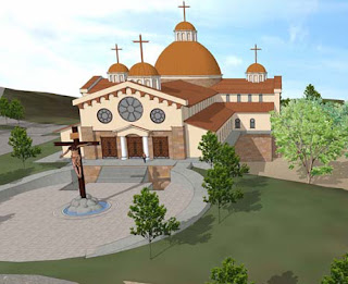
Some time back, D Mac over at the wonderful Creative Minority Report did a piece on a distinctly disappointing proposal for a west-coast shrine to the Divine Mercy. Note the picture above. While mildly traditional--cruciform plan, check; domes, check; crucifix, check; rose-window, check--the design lacks all of the subtlety of detail and proportion associated with the Church's heritage of art and architecture. I will not offer an extensive critique of the proposal here, but simply pause to say it continues to frustrate me how many ostensibly-traditional large-scale projects are handed off to firms with no recognized background in the field of ecclesiastical design.
The problem is not that it is hard to get beautiful churches built, but that the wrong people seem to end up getting the commissions. Oakland and Los Angeles were, of course, going to go modernistic no matter what, but Houston Cathedral could have been a masterpiece if handled by someone with a greater openness to traditional design, rather than settling for a mediocre pseudo-traditionalism. Bad architecture costs just as much as good architecture; even a simple building can be handled well if an architect can know how to strategically place details and use proportion to his advantage. The handsome, brilliantly-handled austerity of late German Gothic comes to mind, as does the simple adobes of the Southwest and the geometric neo-Byzantine of Otto Wagner.
I ran up the following series of sketches below in the matter of a few hours last night, though I had been mulling over the problem on-and-off for a few weeks now in my spare time. The first is somewhat of a fantasy in the manner of Wagner and Plečnik (officially the most unjustly underrated architect of the twentieth century), drawing on the long tradition of centralized church-planning that is associated wih shrines and martyria, while the second design, with accompanying plan, is a bit more realistic and worth pausing over. It is derived from some of Bertram Goodhue's late forays into a modernized form of California Spanish Revival, particularly his initial drafts for the Los Angeles Public Library, and is intended to be cost-effective by its relatively simple detailing, and suitably local in precedent. We have discussed Goodhue--and Cram's--interest in the Spanish Baroque here in the past, though here it is rendered in a somewhat more modernized late-Goodhue idiom.


You will note there is very little actual ornament, save at key points such as doorways and the crown of the dome, leaving the decoration to the simple, sculpted forms of the buttresses and massing itself. There is some similarity to a number of public and private buildings being built in Florida at present, as well as the work of George Washington Smith. I imagine the design as stucco, predominantly white or beige, or even a pale roseate color, with grey stone trim at strategic points and a mosaic dome in a greenish-blue with geometric patterning; the dome's tiling would probably most resemble the Pima County Courthouse in Tucson in overall mood. I have avoided curves where possible--they tend to cost more--only using them for maximum effect, the same with sculpture. The use of stucco also prevents the occasionally oppressive affect of large stretches of unrelieved brick, and would provide a splendid canvas for the long shadows of afternoon and evening along the structure's flanks. The last drawing, after the little sketch of the floorplan, are some half-thought-out variations on both schemes.
Ultimately, it is not a matter of money, but what the architect does with it. Every new church can either be a test-case for tradition or a concession to contemporary mediocrity. Why settle?


