Wednesday, March 21
Noble Simplicity?
However, the church builder must face budgets these days, and while starkness is hardly to be praised, making a virtue out of the necessary plainness brought on by the expenses of building is much to be admired.

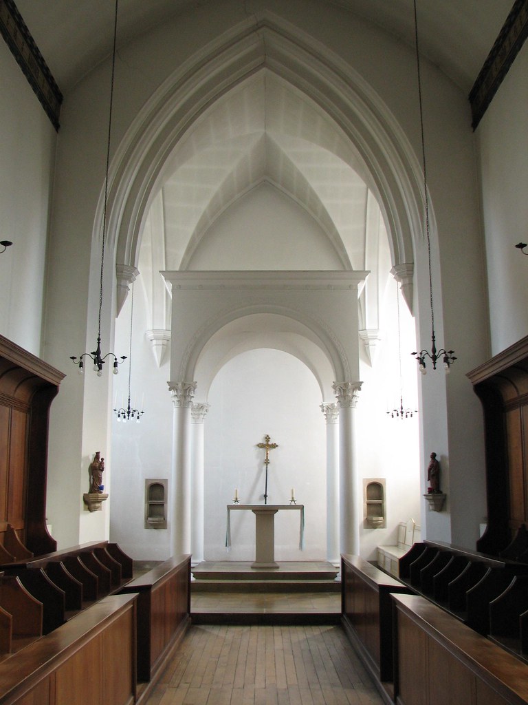
Photo by Fra Lawrence, O.P.
In that spirit, I suggest you study the splendid simplicity of the image above, Sir Ninian Comper's uncharacteristically restrained ciborium design for the (Anglican) Cowley Fathers' Bodley-designed chapel at St. Stephen's House. A similarly simple and splendid chapel was designed by Cram late in life for their foundation in Boston.

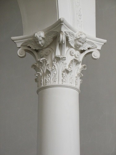
Photo by Fra Lawrence, O.P.
There are two tricks in the architect's bag when it comes to solving such problems: the first is a very careful and discrete use of form highlighted with small but telling detail, the second an intelligent use of color. The first of these is very strikingly shown here, and despite the monastic whiteness of St. Stephen's, Comper often used the second in many other projects of his. (Though here, we see a similarly subtle use of light and darkness; reflected light or a pleasantly ecclesial murkiness can cover a multitude of architectonic sins.) Everything is well-modulated, with simple but well-studied outlines that suggest the resolution of a more complex mental process, rather like Borromini's more highly geometrical but equally low-budget versions of Baroque. (Indeed, the column details remind me more than a little of Borromini's fondness for cherubs.) The stone table-altar altar is somewhat unconventional for what I know of Comper, and not suitable for a large parish church, but well-scaled to the small and delicately-balanced composition that is this chapel.


