Tuesday, July 25
The Baroque Qwik-E-Mart Artistically Considered
Strolling through the internet, I was catching up on back issues of the wonderful detroitblog, and came across this posting (March 3, 2006) concerning a crumbling but still intriguing art deco liquor store on the west side of Detroit.You still think I’m trying to be funny.
The pictures, and the author’s adept prose made my mind wander and wonder what a baroque convenience store (or laundromat, or check-cashing outlet) would look like.
Either that or you’re imagining something like David Macauley’s doodle of a Borrominian port-o-let in Great Moments in Architecture. At first glance, a rococo Laundromat might seem an opportunity to engage in ironic froth, like a Louis-Quinze retrofit of some nineteenth-century temple of commerce. I’d probably have a grand old time with it, for sure—it’s the kind of wacky thing I love to daydream about. But the question’s a good one, and in the end, a real one. The truth is, baroque’s more than just a matter of laying on the ornament with a trowel. If baroque’s a viable style, it should be able to do a convenience store as well as it does a church, a palace, a garden folly extravaganza.
People often forget that baroque includes a lot more than just curlicues, an idea largely derived from a misapprehension of the flamboyances of its Mexican and Spanish incarnations with their vast diagrammatic acres of ornament, but even there, you have, on the lower end of things, the mission church with its simple, rough lines and its rude, humble saints. The Baroque—as with the Gothic before it—is about ornament, of course, but it also is about a deeper logic, a sense of ordered hierarchy and decorum, that sometimes manifested itself in urban geometric playfulness, or gilding run riot in a church, or even a simple, ennobling little detail on an otherwise unremarkable Roman tenement.
Baroque was the default style of Europe for almost two centuries, and while it might be a stretch to call every peasant hovel an example of the style, there were certainly a lot of simpler, humbler dwellings that partake of its logic. The genetic code of classicism—the five orders of Roman days—include the rustic Tuscan and the simple Doric as well as the fecundity of Corinthian and Composite, and even Tuscan could get pared down into a simple row of pilaster strips.
There were simple palace stables and garden sheds even at Versailles, while most of Rome’s ubiquitous stuccoed apartment blocks are exemplars of a pared-down architecture of simple, practical shapes dignified and enlivened by elegant, charming little details here and there in stucco—a pleasant window frame here, a doorway surround there, all appropriately simple in keeping with the purpose of the place, and its hierarchical place in the greater scheme of things.
Occasionally, a full-throated residential baroque is allowed to burst through the Roman cityscape, apart from grandiose palazzi and churches; even then, it is keyed into the logic of the city plan, and the celestial hierarchy it reflects. The best example is the wonderfully theatrical, yet pleasantly simple, set of Roman rococo townhouses that define the hemicircular piazza before the church of Sant’ Ignazio, part of the old Jesuit College.

Piazza Sant' Ignazio, Rome
The architecture is delicately planar and curvilinear—a vivid massing of columns would steal the thunder from the great travertine slab of Sant’ Ignazio’s façade—festive, and yet distinctly deferential; participating and shaping the little world of the square, and yet unmistakably “private” in its orientation. It is theatrical, not in a false sense, but because it helps set the stage—and reminds us of the profound reverence the Baroque had for theater as a mirror for the universe and its many movements.
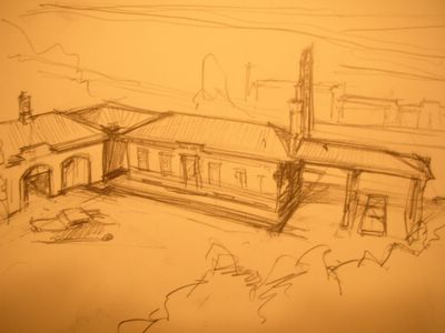
But getting back to the question at hand: a baroque gas station. It would be fun to imagine a little tempietto of commerce in the festive, jolly nineteenth-century mode, fitted up with cast iron, self-service pumps, and a little allegorical figure of Mercury presiding over the exchange of Twinkies and Coke; but that sort of opulence would be suited more to Harrod’s than BP, in terms of urban precedence, hierarchy and just matters of plain cold cash. The baroque solution is a bit simpler, and probably just as practical as anything being done today. You’d probably have a low, stuccoed, simple building with a tile roof—at least in southern climes—and a row of simple rectangular windows, their austerity relieved by dignified, if somewhat plain frames. The decoration would be simple and subtle, not unlike the deco liquor store that got this whole thought process running.

A Gas Station in the Manner of the Roman Vernacular Baroque
A little detail here and there—a little cupola to vent the fumes from the garage, a chimney pot, a turn of the molding—would bring a warming touch of life to the structure. Instead of a Shell Station with its garage and its plastic marquees, you’d probably see a simple, rustic collection of buildings like a stable-yard, with a practical but dignified wooden canopy covering the gas-pumps. Perhaps not the Grand Trianon, but a humane balance of dignity and practicality which could enliven a small but very important part of everyday life.


