Sunday, June 11
Our Lady, Queen of the English Martyrs
Images © 2006 Matthew Alderman.
[My hypothetical project for an Anglican Use Parish in Chicago is old news to our repeat readers, but I thought it would be of interest nonetheless as it's the most complete presentation I've made of the complex so far, as well as allowing to display a number of higher-quality photos and details of the design. Once again, many thanks to Joe Blake and the Anglican Use Society for their interest in my work, and for the many kind words I received from conference attendees. One new addition is a smaller more economical 300-seat version of the project intended for a suburban site, appended at the end of the article. I hope to post a few more of my sketches for this variant in the near future.]
One hundred years ago, the United States was reaping the fruits of a golden age of ecclesiastical architecture. Gothic masters such as the Anglican Ralph Adams Cram threw off the dominant American paradigm of the meeting-house, and replaced it with the ideal of the church, not a lecture-hall but the home of the Real Presence, the icon of the city of God. Likewise, today, many have begun to re-consider the choices of the sixties, and like Cram, raise the cry for an architecture that expresses the transcendence of the Incarnate God and the fullness of our two-thousand-year-old Christian tradition.

As a graduate of the School of Architecture at the University of Notre Dame, I’m no stranger to this debate. The School trains its students to work within the ancient tradition of western architecture—not as mere copyists, but as inheritors of and innovators within this heritage. In Fall of 2005, I designed Our Lady, Queen of the English Martyrs, a hypothetical Chicago parish church and center under the tutelage of Professor Thomas Gordon Smith, one of the acknowledged leaders in the return to tradition in church architecture. We were given a refresher course in the orders of Roman and Greek architecture, as well as a mini-retreat given by a Benedictine priest and chant scholar. We were charged to see the church not as a multi-purpose hall, but as the temple of God, an ideal seemingly forgotten today.

The tragedy of this loss was thrown into stark relief by the parish’s hypothetical site in Chicago. We were replacing the 1997 parish church of Old St. Mary’s, a “progressive” structure designed to look like watered-down imitation of the modernism of nearly half-a-century ago. It feels less like a place of eschatological grandeur in the presence of God than a frighteningly clean airport concourse. Admitted, there’s some iconography, like the walk-through womb-shaped baptismal font, which prompted a female classmate to remark that the only thing she needed to be womb-shaped was inside of her and she hoped it stayed that way.
Still, the parish conducts a lively ministry to the area’s growing population of young professionals. The church looks poised to partake in a general revival of the neighborhood. A majestic parish church in the great Chicago building tradition would have done wonders as a reminder of God’s majesty in this bustling place which sometimes seems too busy to pray. The existing complex doesn’t even try. The site was hemmed in on three sides by a disused raised rail line, an apartment block, and a narrow back alley. Any parish complex which would rise there would risk being a house of God dwarfed by the high-rises of the city of man. We also had to find a way to cram in a parish hall, offices, a rectory and, if we could rise to the occasion, a parish school.

You may wonder, with all this to distract me, how I had time to bring in the Anglican Use. I’ve followed the Pastoral Provision for some time now, and this project struck me as perfect opportunity to explore its rich tradition further. In an age struggling to understand the true meaning of the Second Vatican Council, the Anglican Use is undoubtedly one of the most precious fruits of its commitment to ecumenism, neither losing Catholic Romanitas or the cultural treasures of the Anglican heritage.
As a cradle Catholic, I can’t speak of the conversion experience, but the Anglican Use shows me the relevance of English-speaking culture to Rome. The Anglican Use brings with it a comprehensive liturgical integration of art, music and architecture spiritually similar to the grandeur of Continental Catholicism. Here, this heritage was unfortunately stunted by the battle-zone conditions of American Catholicism, with the fortunate exceptions of a few happy pockets where ethnic tradition still holds sway.
But how could I embody in my design the specificity of the Anglican Use within the universality of the Catholic Church? What style should it be in? Gothic, with its stained glass and medieval piety would seem the most logical choice. But, as you can see, I did not design a Gothic church. Don’t get me wrong. I’m a great supporter of Gothic, and have a great fondness for some of the new Gothic churches that have been built in recent years, such as Our Lady of Walsingham and Our Lady of the Atonement. Professor Smith, who is a man of catholic tastes, would have been quite happy for me to design Chicago’s answer to King’s College Chapel. However, in light that I had the opportunity to work under the tutelage of Professor Smith, a classicist and an enthusiast of the rigorous ingenuity of the Roman Baroque, I decided to start with the unique Anglican Baroque of Sir Christopher Wren and create an idiom both English and Catholic.

Before the Reformation, English Catholicism possessed unique liturgical and artistic tradition in the form of the Sarum Rite. I began to wonder what English Catholic architecture might have become had the Reformation never occurred, and its culture had remained tapped into the Continental mainstream. Baroque, the favored style of post-Reformation Catholicism, does not just mean a building plastered with ornament, any more than Gothic is only about spiky finials. It derives its inner logic from a sophisticated geometry of curves and counter-curves and the concetto, a symbolic concept expressed iconographically through the whole design. A building becomes an expression of a vast spiritual idea that crosses the boundaries of different artistic media and touches the soul, engages the intellect, and delights the senses.
While English Baroque is predominantly a palace architecture, its greatest monument is a cathedral, Sir Christopher Wren’s immense St. Paul’s, and a number of London’s post-fire city churches were built in this style by Nicholas Hawksmoor and James Gibbs. Still, the theology they embody is not as explicitly Catholic as the Anglican Gothic churches of a century-and-a-half later. How to make that Catholicity more apparent? I started sketching. Architecturally, the simple muscularity of English Baroque could be given a Catholic twist. English Baroque is predominantly a two-dimensional architecture of applied ornament; I sought to bring it into three dimensions with the sculptural, incarnational vigor of Rome.
I also discovered I wasn’t the first person to tackle this problem. The masterwork of the Edwardian architect Sir Edwin Lutyens’s career was Liverpool Metropolitan Cathedral, a vast structure that blended Wren, St. Peter’s, and Hagia Sophia, while his follower H.A.N. Mead designed Catholic and Anglican Cathedrals for New Delhi that partook of this same spirit. Around the same time, the church-furnisher and artist Martin Travers provided designs for Anglican churches which mingled Continental Baroque with an authentically English, even medieval sensibility, which appealed to my Gothic streak.

But back to the parish. Let’s pay it a visit.
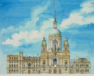
Our Lady, Queen of the English Martyrs is a city parish in the grand Chicago architectural tradition. Perhaps our first glimpse of it comes while walking down South Michigan Avenue, or maybe we catch sight of its green copper dome from some distant overpass. On the outskirts, Chicago is a city of spires looming over a great sea of little roofs, a graceful and European sight. It’s a hot summer day, let’s say. The church’s strong silhouette dominates the skyline, holding its own against the fifteen- and twenty-storey apartment blocks that have begun to sprout up around it.

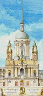
The afternoon light momentarily transfixes the windows of the immense lantern, the dome moving in perspective above and behind twin bell-towers. Sculpted crowns and martyrs’ palm-branches in relief cluster beneath the cornice, while the strong massing of the façade casts deep shadows on the honey-colored stone.
The church rises majestically out of the void created by the low-lying classical outline of the parish plant. This complex contains a rectory, a parish hall, offices, a nursery and a K-8 school for 500 students including library, dining hall, rooftop playground and underground gym.

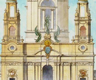
Between the twin bell-towers stands a copper image of the church’s patroness, Our Lady, Queen of the English Martyrs flanked by two angels. I wanted to dedicate the parish to Our Lady of Walsingham, but I also wanted to include the numberless English martyrs of the sixteenth and seventeenth centuries, St. Thomas More, St. John Fisher, St. Margaret Clitheroe, and others, as well as those of the early centuries of English Catholicism—the soldier-saint Alban, or the slain kings Edmund and Kenelm. She holds in one hand the lily of Walsingham, while the Christ Child bears the nails and crown of His Passion.

The façade also features the insignia of the Trinity—the sacred Hebrew initials of the Tetragrammaton, the dove of the Holy Ghost, and the Arma Christi—the instruments of Christ’s Passion arranged in heraldic fashion. On either side are the insignias of the Anglican Use—the St. George’s cross with keys of St. Peter—and the phoenix of the Chicago Archdiocese. The Corinthian order of columns with their flowering acanthus-leaf capitals commemorate the maidenly and queenly strength of the Virgin for whom the church is named. The dome bears the insignias of the four evangelists, while its lofty needle gives the Baroque structure a Gothic verticality reaching upwards to heaven.

Entering through the central doors, we pass through the narthex. On the left-hand side we glimpse the baptistery behind a wrought-iron screen. The octagonal font is covered by a massive wooden lid, inspired by Gothic precedents, but given a baroque articulation which calls to mind the church’s dome. The simple lines of the domed chamber suggest a sepulcher, in which we are reborn in Christ. The baptistery, like the rest of the church, is faced with carved grey stone, highlighting the gilding of font that stand in its midst. Its placement—open to narthex and the south aisle—recalls both the baptistery of Roman tradition, and the English custom of placing a font in a side-aisle. Images of St. John the Baptist and the early English martyrs make the chapel’s significance even more apparent.

Our eyes have begun to adjust to the darkness from the hot bright light of the Midwestern summer. The church’s nave is faced in pale grey stone, set off by bursts of ornamentation in the Corinthian capitals and the richly-colored polychromy of wooden side-altars. Votive candles glow in the shadows of the side-aisles. Everything is suffused by the mysterious blue glow of stained-glass windows far overhead.

The church’s plan is a Greek, equal-armed cross, seating around 500. Tather than being pushed so far back to be invisible from the street, the central dome is visible from the street. It is also an appropriate response to the comparatively shallow depth of the site, which would have made a more conventional plan difficult to achieve. We move up the center of the nave, and through the iconography, move forward in time. In the side chapels, are confessionals set into the wall below enshrined images of St. Austin of Canterbury and St. Gregory—recalling the early missionary roots of the English, their ancient fealty to Rome, and the cleansing power of the keys which binds and looses. We come to the crossing, looking up to the great dome where vast slants of light fall on the richly-carved stonework. In the right transept chapel stands the Altar of the Lord’s Death, a massive wooden side-shrine with folding wings, mingling baroque and Gothic traditions in its shape and iconography.

Its dedication recalls the name of a chapel that stood near the great shrine of Walsingham in the Middle Ages. Its iconography recalls the medieval tradition of the Mass of St. Gregory and the Man of Sorrows, showing a wounded, suffering Christ surrounded by the instruments of His torture—spear, sponge, nails, whips, thorns. On each of the tryptich’s wings, as we pass from the age of St. Augustine to that of the persecutions, stand images of six of the English Martyrs. Through a grille nearby we glimpse more stained-glass blue and catch just a hint of the Lady Chapel beyond, which serves the community as its daily mass and adoration chapel.

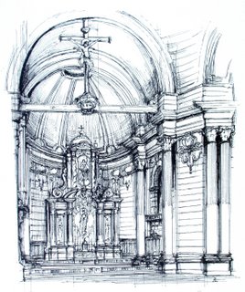
And before us is the high altar. Standing distantly in the curve of the apse it is a restrained crescendo of gilding, wood and polychromy against the rich, grey stonework. It has always been before us ever since we set forth in the church, gold leaf distantly winking in the glow of the red-glassed Presence Lamp with its adoring brass angels and martyrial crown. On the left hand a small chancel organ looms above the rich dark wood of three ranks of choirstalls. Following English custom, there stands antiphonal choir between the crossing and the high altar, placed against a reredos as customary in the Anglican Use. The depth of the chancel allows a certain necessary sacred distance to be placed between congregation and celebrant, compensating for the lack of procession possible in a centralized plan. A rood-beam marks the dividing line between chancel and nave, a threshold to heaven marked by the glorious sacrifice of the Cross.

The twisted columns of the uppermost register are a common symbol of the Temple of Solomon—and thus the Holy of Holies, and can be found both in English and Continental Baroque. They flank an image of the Trinity, the Throne of Grace, showing the Father enthroned and bearing the crucified Christ in His arms. On either hand stand two angels in the albs, amices and cinctures of medieval acolytes, one holding the ever-turning sword of flame from the Book of Genesis, the other bearing the burning, cleansing coal of the Prophet Ezekiel. The one wards off the unrepentant sinner from the presence of God on earth, the other beckons to the penitent to come and be healed through penance, absolution and then Holy Communion. The lower register of columns flank the effigies of Our Lady, Queen of the English Martyrs and Saints John Fisher and Thomas More. With their common background of swirling heavenly clouds, the reredos becomes the altar-as-triumphal arch, as window, the place where heaven is opened up and God’s grace pours to earth.

Over the altar, surrounded by a sunburst and standing on the upturned horns of the moon, as the Apocalyptic Woman Clothed with the Sun, is the Virgin herself, bearing up the Christ-Child. Inspired by both baroque and Gothic images of the Virgin, I sought to give her a bearing both maidenly and regal, conveying her inner sanctity with outward beauty, and a face both smiling and yet bearing a secret trace of the bitterness of her Son’s sacrifice. Her vesture is scarlet and gold, colors both sacrificial and royal, and she also bears the ermine of kingship. As with the image crowning the church’s façade, she bears up the Christ Child with the crown of thorns and Passion nails in a cruciform posture that recalls His crucifixion, as well as the golden lily of the Virgin of Walsingham.
[I've been more than a little amused by the remarkable range of reactions this image of Our Lady has generated. A number of people think she's a little too glamorous, a little too pale and European, while others have absolutely loved it, and still others have seen in her gaze a mixture of majesty and sorrow. I understanmd the criticisms, they're valid, and I appreciate the comments. She's sort of stuck with the informal name Cover-Girl Mary as a consequence; one of the funniest comments I got said that she looks like a design for the old Ballets Russes...assuming they ever did a piece called Notre-Dame des Réactionnaires. Yes, she is a bit younger and prettier than some Madonnas, especially the bland plaster variety--though no more conventionally good-looking in relation to the standards of the era than the gilt-haired Schöne Madonnas of medieval Germany. I admit trying to blend Gothic and Baroque via Art Nouveau was perhaps a bit experimental. Still, I rather like her. I also know in the future it'll be my client, and not me, that'll be calling the shots.]

The themes of reunion and of Marian devotion continue in the Lady Chapel we have briefly seen before, dedicated to Our Lady of Walsingham, while a side-altar is dedicated to the martyr Margaret Clitheroe. The Lady Chapel was designed to serve also as a daily Mass and Adoration chapel with three confessionals and access from an outdoor parking-lot when the remainder of the church is locked, saving on maintenance and the onerous demands of heating a Chicago church in the winter.
Turning our attention from the church to the parish complex, covered access from one of the transepts to the Parish Hall and the school above allow access in winter, while parents can drop off their kids at the front lobby safely under the eye of the front desk. On the ground floor are housed the parish offices. On the right side of the church is the smaller Rectory block with room for several clergy and guest apartments and common rooms, as well as a small office for housekeeping staff. I briefly considered including larger apartments for married clergy, though after inquiry discovered that probably offsite housing would be more tenable.

Our Lady, Queen of the English Martyrs has been for me a fascinating exploration of the relevance of Rome to English-speaking Catholicism, and of English-speaking Catholicism to Rome. I hope it may serve to make us demand the beauty that God's house deserves from our architects, artists and church builders, as we step into this new century.


